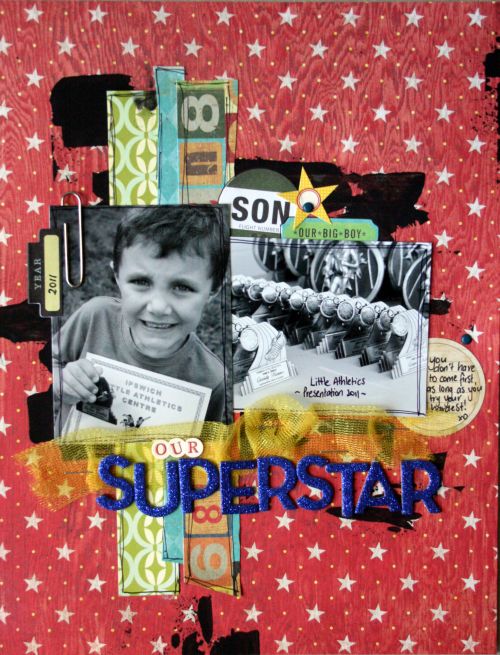
Using paint of my backgrounds is my favourite technique at the moment. It's a great way to add some depth to your page and draw the eye in to the main elements.
I start by positioning my photos on the page and visualising how I want to layout to "flow", thinking about where I will be placing papers etc.

I then dip the end of an old card (in my case a spotlight card!) into my blob of paint, using a smaller amount for lighter strokes, or a larger amount of paint for heavy, thick strokes.
 I find I have more control using a smaller amount, I can then go over at again if I want it thicker. You can also create small "splats" by using light strokes when most of the paint has been applied and the card is nearly dry.
Once the paint has dried you can can then finish your page off with papers and embellishments. I find using less actually compliments the effect of the paint!
 Crystal
xo

That technique is awesome Crystal! Thanks for sharing!! I think I might have to give this one a go.
ReplyDelete